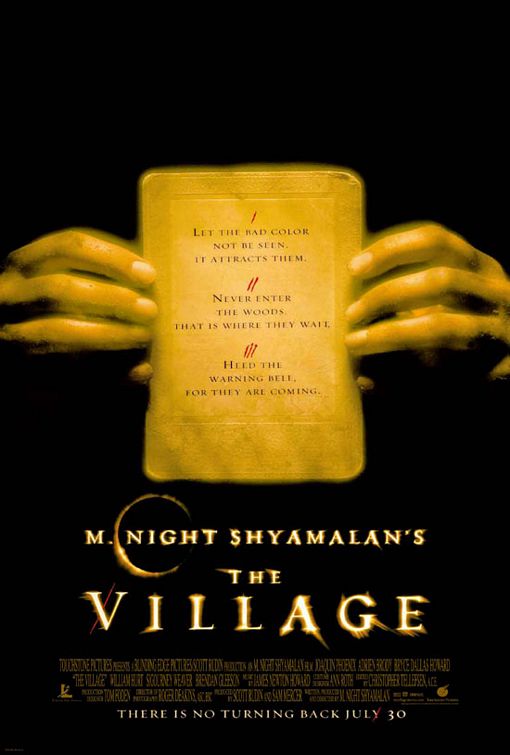
| Chase | 05-27-2004 15:47 [E,W] | | Boring. I like the artwork on the website with the house, that should have been the cover art. And why are all his posters orange? And why is he trying to be like HITCHCOCK? YOUR NOT HITCHCOCK! And is it just me or do you see the ring.... | | Dirty_birdy | 06-03-2004 06:52 [E,W] | | I think it sucks...... I agree with the other dude.... the house on the website looks way better.... and I thought of the ring when I saw that little eclipse kinda looking thing too.. but it's only a poster... so I'll mellow out.... | | Kirsten | 06-03-2004 17:04 [E,W] | | Unlike my esteemed associates, I find the movie poster quite intriguing. I enjoy Mr. Shyamalan's films. His writing is solid and his direction is nearly flawless. His Hitchcockian style is a great tribute, but retains his own unique flavor. Let's not compare his great work to the wretchedness of 'The Ring'. The poster is a well conceived design that captures the quaint and puritanical theme of the film. | | Charlotte | 07-05-2004 07:54 [E,W] | | I agree with Kirsten, the poster is intriguing, and I for one will certainly be seeing this movie. The simplicity of the poster arouses curiosity and fascination, and subsequently people will go and see the movie! I have always been extremely impressed with Shyamalan's previous work, and eagerly anticipate the releases of The Village! | | Justin | 09-25-2005 13:26 [E,W] | | While I really enjoyed this film, this isn't exactly an enticing design. It's too symmetrical, and I really dislike posters that rely mainly on text to win me over. |
|