IMP Awards > Annual Awards > 2005 > Worst Teaser Poster Winner
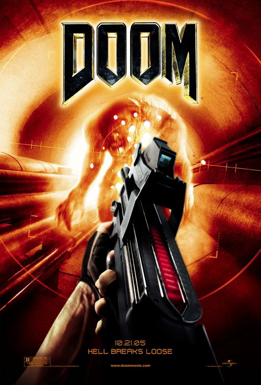
Doom (2005)
The idea of having the poster look like it is an image from a first-person shooter was a good one, but something seems to have gone terribly wrong here. The plastic-looking gun, the 'too blurry to be menacing' monster, all those white splotches - it has more of a feel of one of those 80s light gun games at the arcade than the actual video game it is based on. Looks too much like a video game to attract average movie-goers and too little like the actual game to attract the fans.


