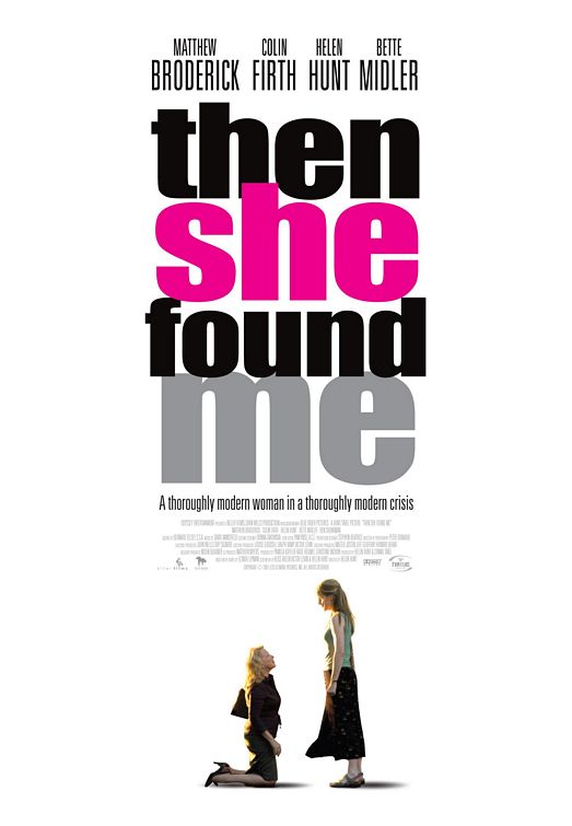
| dereck | 04-04-2008 15:51 [E,W] | | Nicely designed! | | peter | 04-12-2008 11:01 [E,W] | | very nice design.... | | Adam | 04-21-2008 06:24 [E,W] | | What a hideous poster! Ok, the title is fine, a little generic, but fine. But come on, the designer's can't expect to just photoshop an image from the other poster and shove it on this one. The green/yellow colour scheme from the previous poster looks digusting below the pink font. Not to mention the fact that the image is dull and poorly cropped. Disasterous! - 2/10 |
|