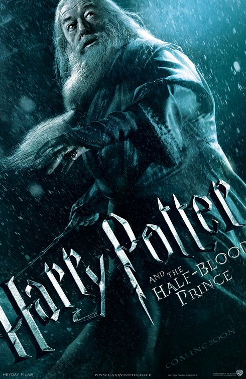
Harshcritik - go fly a kite. This poster is great, only thing you're remotely close on is all type to be on the same diagonal.
brady
Woah! Get an umbrella big ''D'', it's raining hard!
Harry fan
These are international, look at the URL
poster cricket
... i don't know i kinda like this one better!
Philip J
harshcritik -- Harsh is right. It's not THAT bad. It's not really worth picking on. Not so great that it warrants a lot of defending either, so I'm done.
harshcritik
Terrible! Why is his face so Hi-Rez and full of contrast and the rest of him soft and pushed back. Awful head strip! And why is the type diagonal, yet type on the bottom is straight? Hack