IMP Awards > Annual Awards > 2011 > Worst Movie Poster Nominees
2011 IMP Awards - Worst Movie Poster Nominees
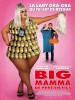 |
Big Mommas: Like Father, Like Son
Seriously, would anyone actually be interested in watching the film based on this revolting French poster? Then again, they went a similar route last time around with an equally revolting French poster for Big Momma's House 2. |
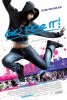 |
Go For It
Where to start? The plasticized belly, the completely inappropriate expression on the girl's face, or the fact that her face seems to have been pasted into the shadows of the hoodie? Now if only they had used the tagline from the previous poster for the film: "She wasn't the best... it didn't matter." Then we would've had a true classic. |
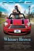 |
The Greening of Whitney Brown
Admittedly, there actually is a scene in the movie where the horse rides in the back of a sports car. It looks phony and unrealistic there but that's nothing compared to the poster. How long must the back of the car be to fit the horse in? And why does nothing seem to have the right proportions here? Also, they've made the actors look so young in this poster one wonders if the actress playing the girl might actually be in her 30s. Aidan Quinn looks more like Chris O'Donnell here! Oh, and if you're wondering, the license plate refers to the name of the horse... of course. |
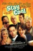 |
Stay Cool
Once again, a poster that seems to be telling everyone to run screaming in the opposite direction. This would've been bad even for a cheap 80s VHS cover. Everyone's been pasted together, seemingly at random, with the stupidest expressions possible on all the guy's faces. Then they use some filter to give it a "hand drawn" feel to hopefully cover up the bad cut and paste job they did. |
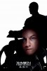 |
X-Men: First Class
We could've chosen either of the silhouette posters for this film for the nomination. This one gets the nod thanks to the unfortunate feeling that James McAvoy's disembodied head is floating in Patrick Stewart's lap. McAvoy's raised eyebrow makes him seem to be saying "Aha! You never expected to find me here, did you?" There are so many interesting things that could've been done with this basic idea. This design (and we use the word loosely) is not one of them. |