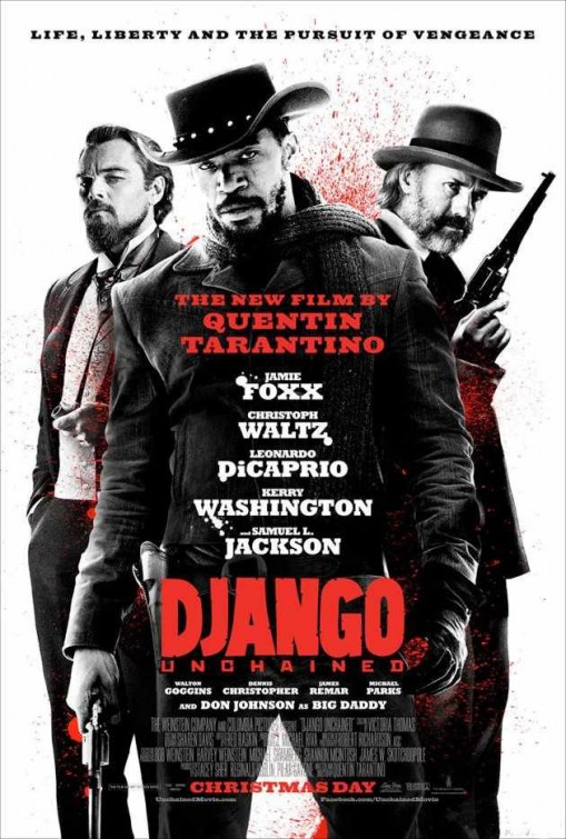
Felipe Dec 26 10:44:32pm Not to say that this isn't a well-executed and effective poster, it's just got too much "Inglorious Basterds formula" flavor.
lidaswan Dec 04 01:31:43pm The bottom of the barrel worst. Tragic missed opportunity by studio to do some fine art.
inglorious color scheme Nov 14 05:57:35pm This screams,"How the hell do we market westerns to today's people?". This would look cool years ago.(Like when "Basterds" did it)By now contrasting black,white and red(in any combonation)is extremly played out.
CloneStamp Wars Nov 13 12:40:41pm I don't think anyone can say this looks cool.
todd Nov 13 01:51:45am NICE. Deceptively simple with a killer use of color/ contrast. bravo.
oof Nov 12 04:01:17pm Too meh for a QT poster.
20/20 Nov 12 02:58:21pm Very cool. I know what I want for Christmas!