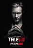
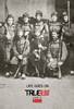
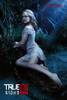
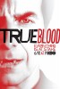
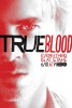
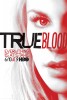
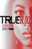
Thought better of ignition than to blatantly rip off martin schoeller's angelina pic–usually they just rip off polish posters. 2 of the same cliche posters in one day-awesome!
Laura
I am curious as to why the person who was creatively responsible for this piece didn't fix the crookedness of EVERYTHING. The piece would have been alot cleaner if one of the nostrils was flopped. The mouth is so painfully off center. The tongue is very phallic, is that a good thing? The sheen on the right side of the top lip looks a little cartoonish. The color pallette is nice. Seems a bit amateurish...
langley
Why does everyone insist to rip off the photo of angelina Jolie
deja-vu
How original!
CCCPEmo
Sorry Ignition, Sorry HBO, but they did a better job.
workingatit
Jennifers Body is much better.
what the hell is up with the tip of this tongue, it looks wierd as does the nose
and the unfocused image.. obviously put together from stock
Alina
It's not in the wrong place, in the series the fang is right there.
Alvaro Carrasquel
Nice poster, almost a work of art, but...did you notice that her ''right canine tooth'' is in the wrong place?
movie freak
I love this poster. Very elegant. like a Vogue shoot or something.
enzo
Okay, Jennifer's Blood and True Blood are cannibalizing each other...